
Redesigning the revenue engine of an event-ticketing platform
Event creation was the platform’s revenue bottleneck. As Lead Product Designer (via Halo Lab), I rebuilt the funnel around one metric — new organizers getting an event live — built the design system that ships it, and designed a new Artist Management module from zero.
One platform, five products, one revenue surface
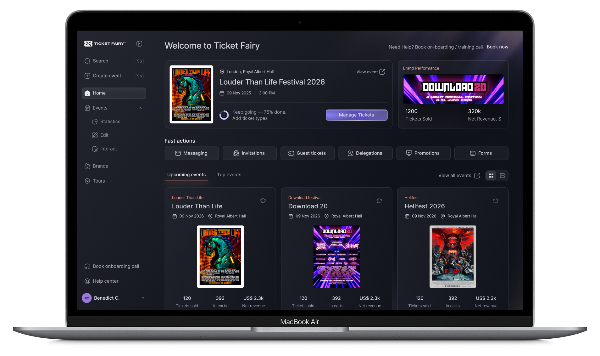
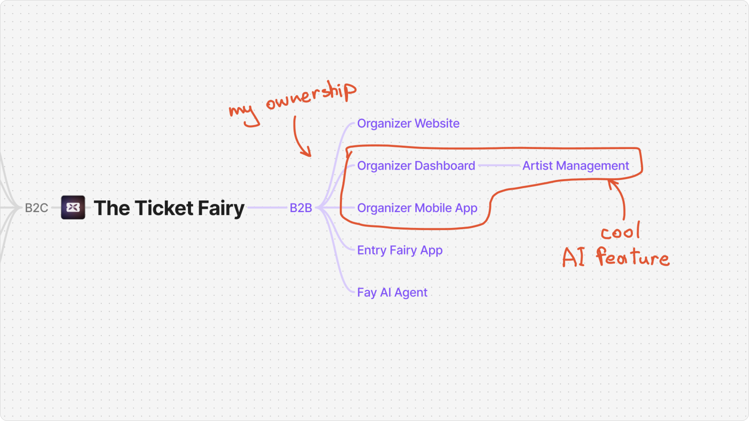
The Ticket Fairy runs a multi-product ecosystem: a B2B dashboard where organizers create and manage events, consumer apps and web for ticket buyers, and an on-site ticket-scanning tool. The commission model makes the B2B dashboard the company’s revenue engine — no events created, no tickets sold, no revenue.
I owned that surface end-to-end: every flow of the B2B dashboard, the design system underneath the whole ecosystem, and a brand-new Artist Management module. A second designer handled the consumer side.
80% of new organizers never created an event
Only 20% of newly registered organizers ever created an event. Since revenue depends on events going live, that drop-off was a direct leak in the funnel — the single metric the whole project would be judged against.
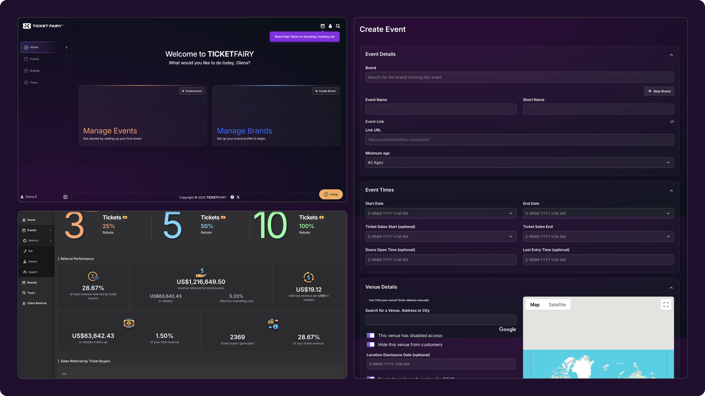
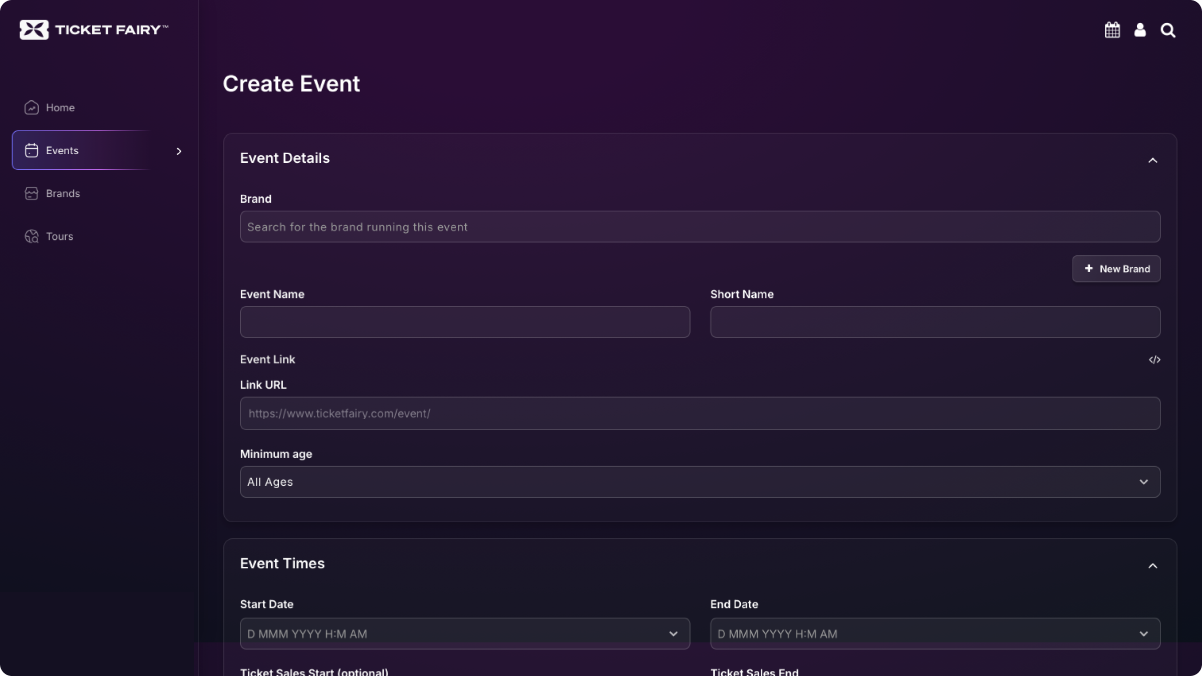
Underneath the number: years of legacy code had produced an inconsistent, dated, low-contrast interface. High-value capabilities — including the referral program, the platform’s most unique feature — were buried in settings. And error states failed silently: an event couldn’t be created until a “Brand” existed, but nothing on the screen said so.
Watching eight organizers fail, on camera
Before opening Figma, I needed to see exactly where and why users failed. I wrote the test scenarios and ran directional usability testing — eight organizers, unmoderated, with video recording — on the core task: complete onboarding, then create an event.
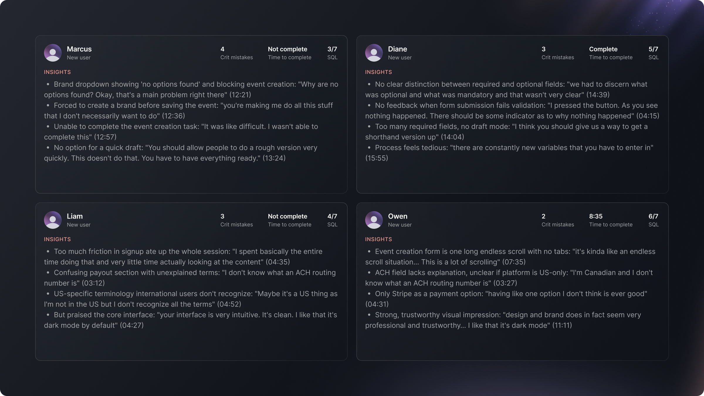
Only about half succeeded. Even those who did hit around four critical errors each and needed up to 14 minutes. The recordings surfaced four recurring failure patterns:
- Brand & location selectors: users couldn’t understand the selection logic, and silent errors left them stuck without explanation.
- Disjointed ticket creation: configuring tickets lived apart from the main flow.
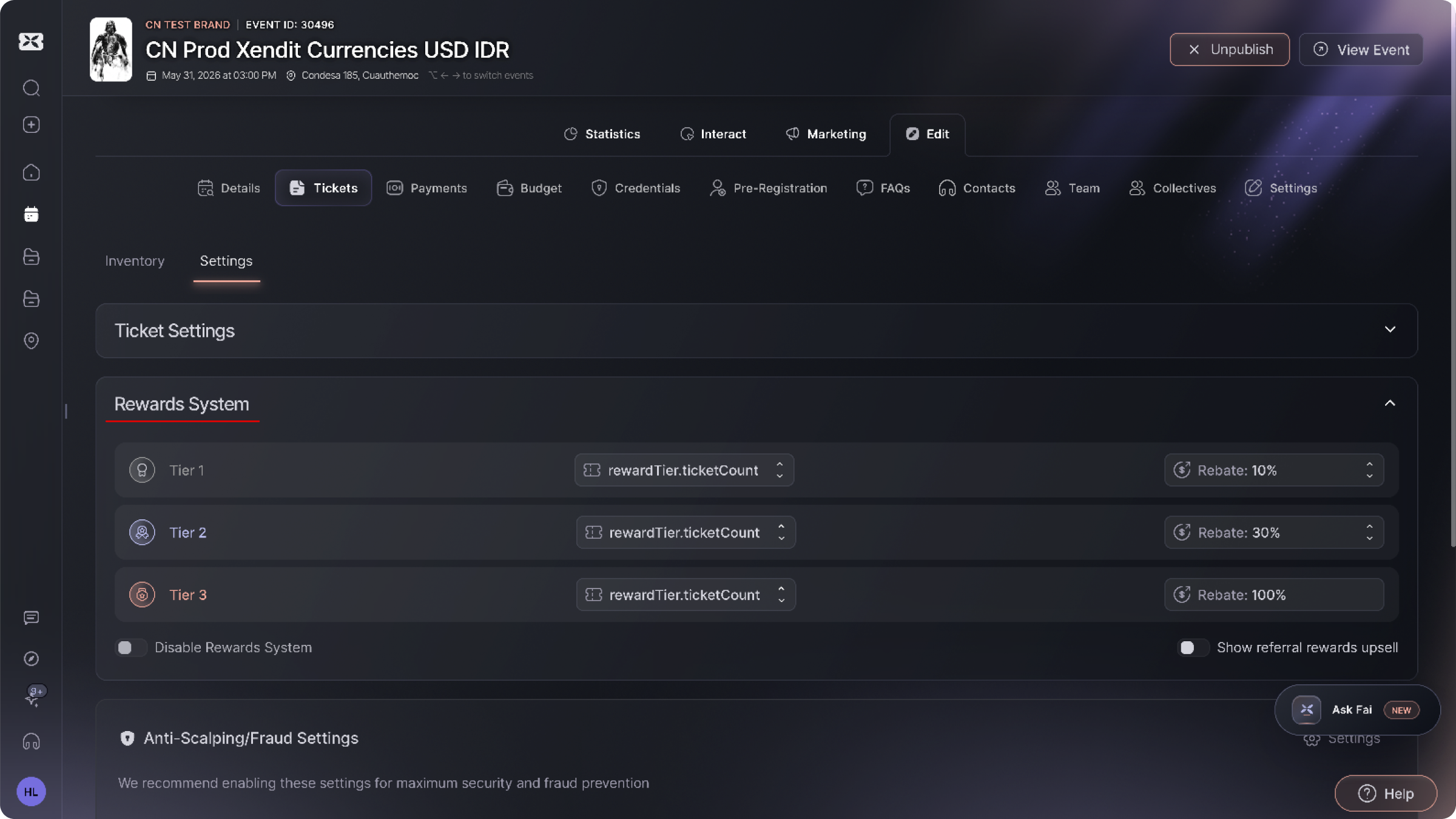
- Hidden referral program: the platform’s highest-performing feature was buried so deep that users never found it.
- Information overload: one dense page carried so much unorganized content that users missed the primary actions.
The decisions that carried the redesign
Every decision below was anchored to a single question: does this help a new organizer get an event live? The priorities followed from the metric — onboarding, event creation, and surfacing the features that actually drive ticket sales.
Event creation as a step-by-step wizard
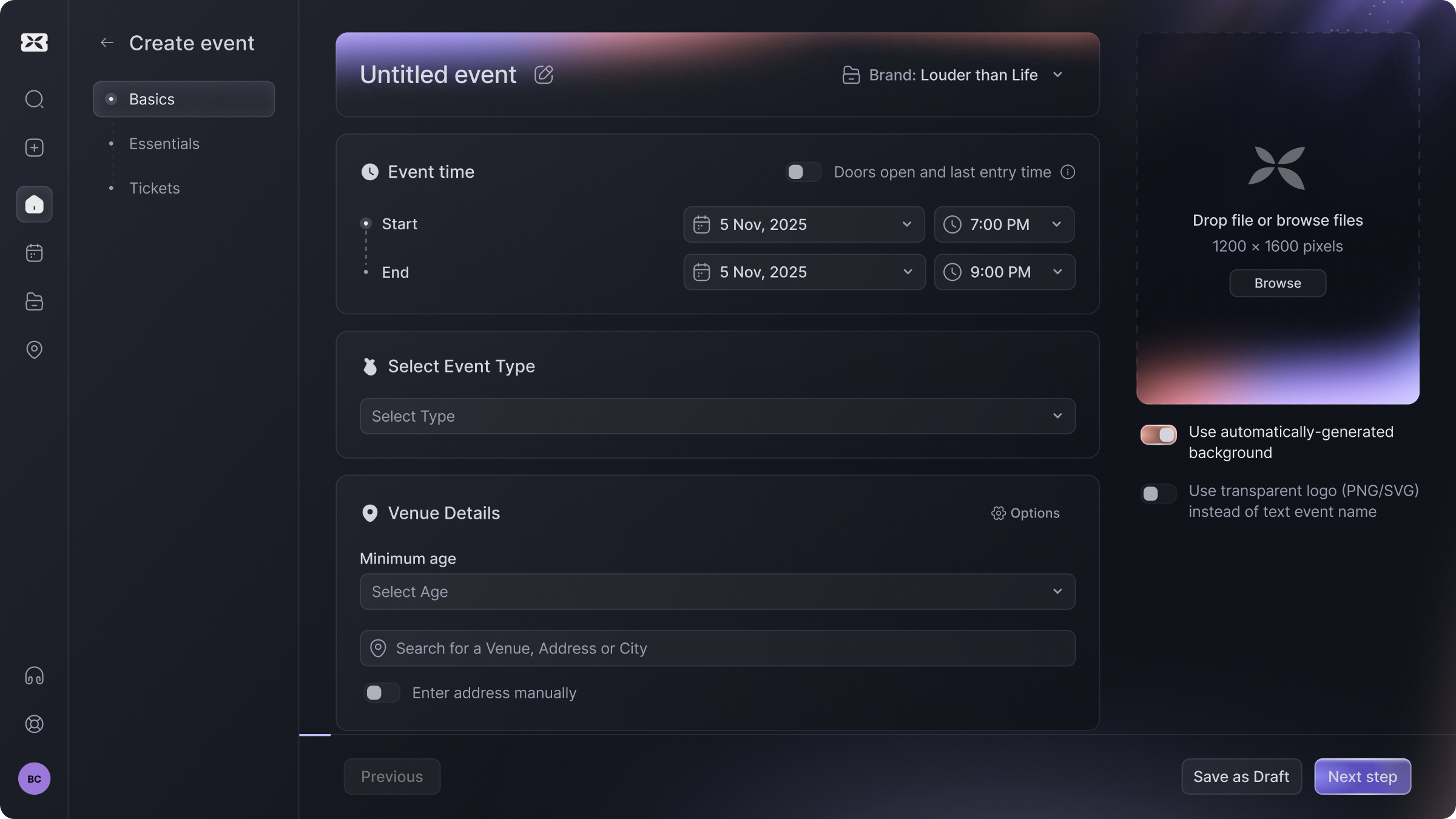
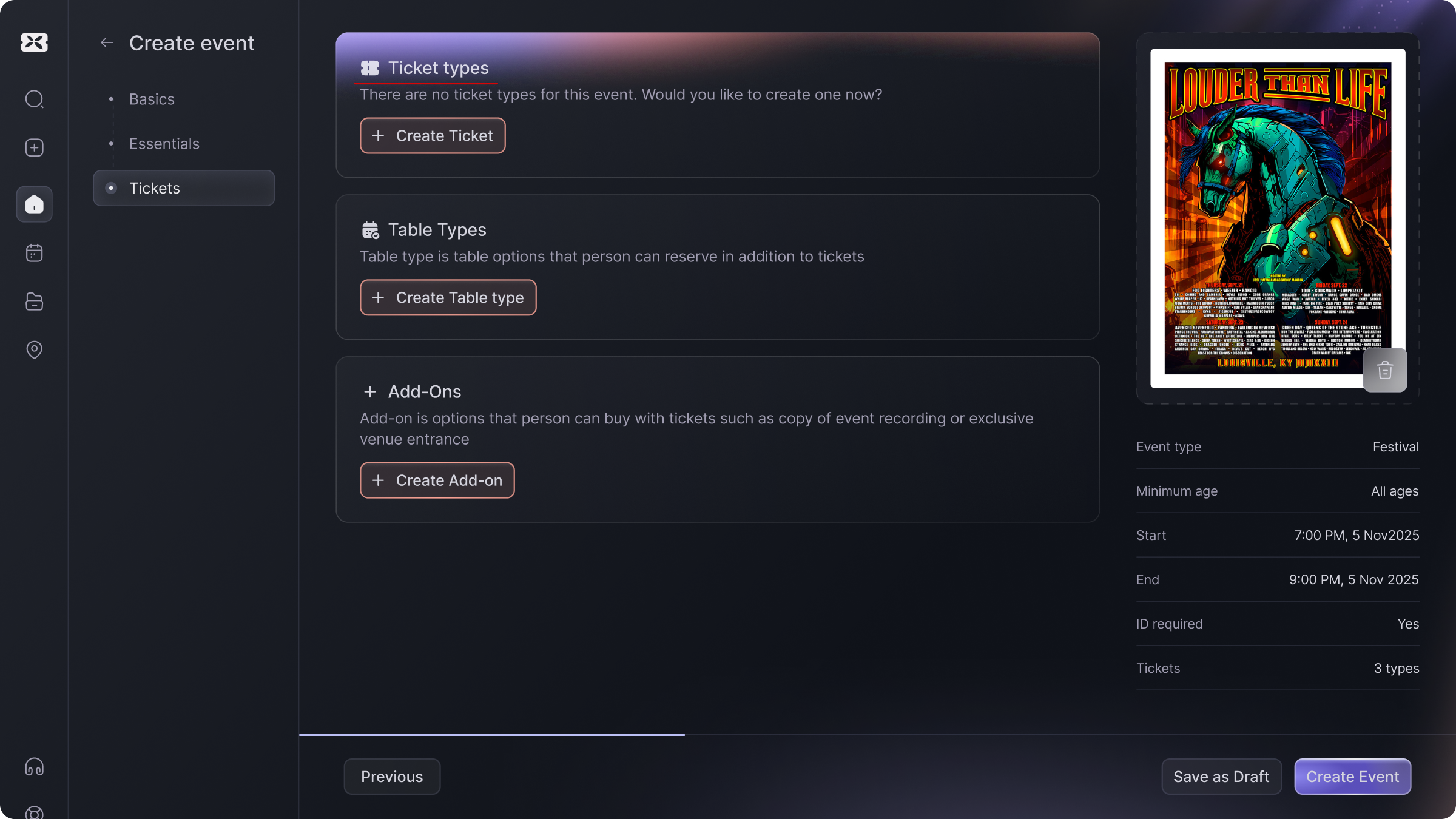
I restructured the most business-critical flow from one overloaded page into smaller, clearer steps. The brand and location selectors were rebuilt to be self-explanatory, and the core creation steps were focused on getting the event configured quickly and accurately.
Surfacing the referral program
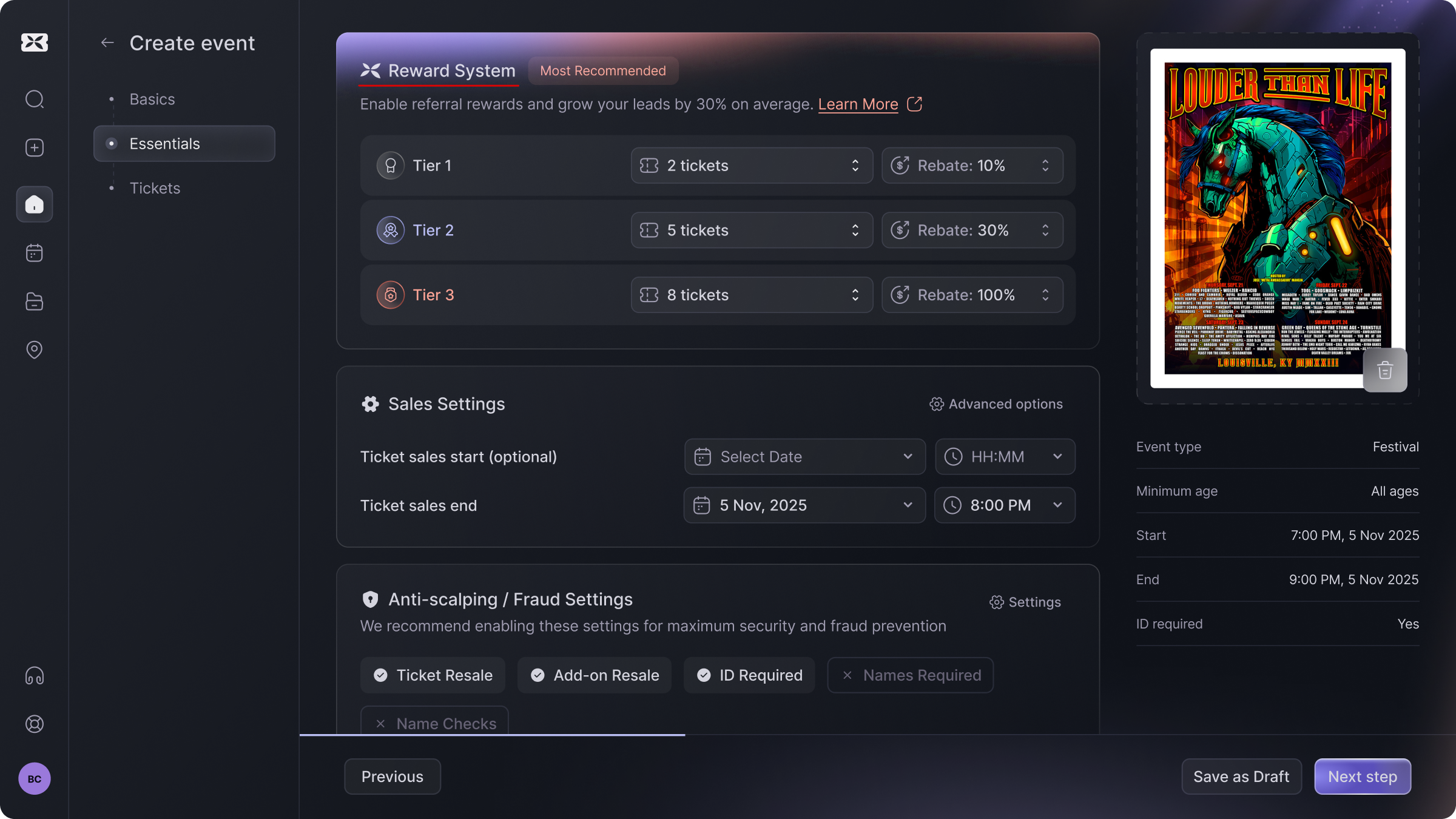
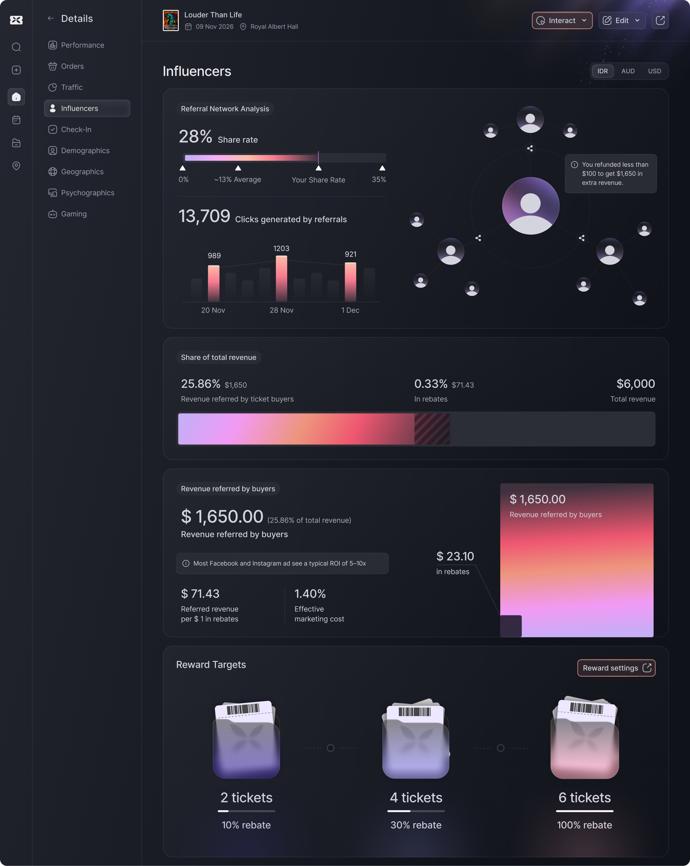
The referral program is a unique, high-performing feature with no direct equivalent among competitors — yet it was hidden inside event settings. Without a support onboarding call, only ~10% of organizers ever set it up. I moved it into the event-creation flow as a prominent, unmissable step: a clear explanation of how it works, links to supporting docs, data-backed messaging on typical results, and a dedicated analytics screen to track performance.
Integrated ticket creation
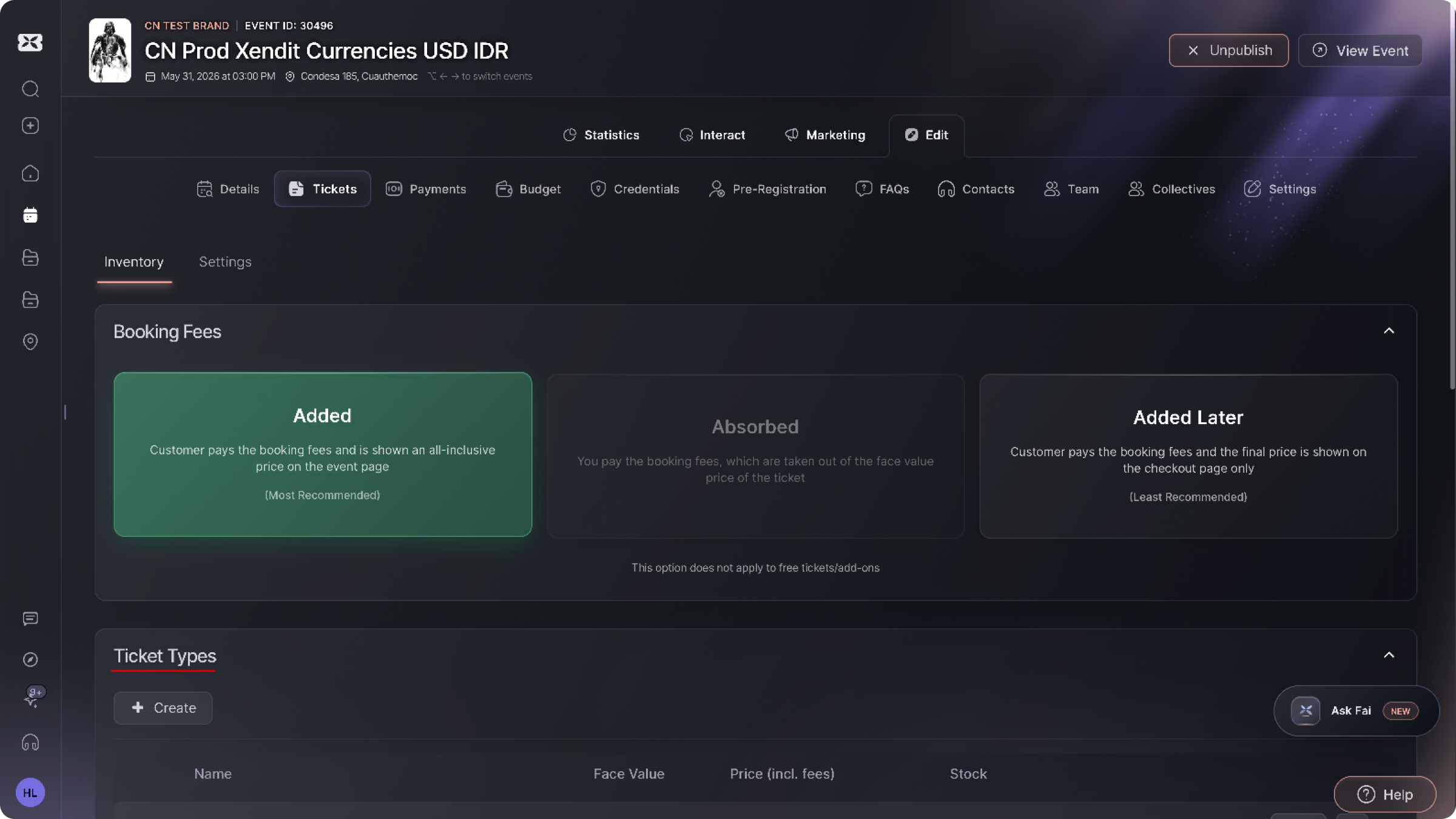
Ticket setup — previously buried in a separate sub-menu — was integrated directly into the wizard as a dedicated step. Organizers can now configure tiers, pricing rules, and limits inline without interrupting event creation.
Tested before, tested after, confirmed in analytics
After the redesign I ran a second round of usability testing with the same scenario and metrics (n=8). Critical errors dropped to near zero and time on task almost halved. Post-launch, product analytics confirmed the business movement.
| Metric | Before | After | Source |
|---|---|---|---|
| Event-creation task success | ~50% | ~90% | Usability testing, n=8 per round |
| Mean time on task | ~14 min | ~8 min | Usability testing |
| Critical errors per user | ~4 | 0–1 | Usability testing |
| Mean SEQ score | 5.0 / 7 | 6.5 / 7 | Usability testing |
| Referral-program adoption | ~10% | 50%+ | Product analytics |
| New users who create an event | 20% | ~26% | Product analytics |
| Support onboarding-call requests | baseline | ~10% lower | Internal support data |
A scalable foundation, built from scratch
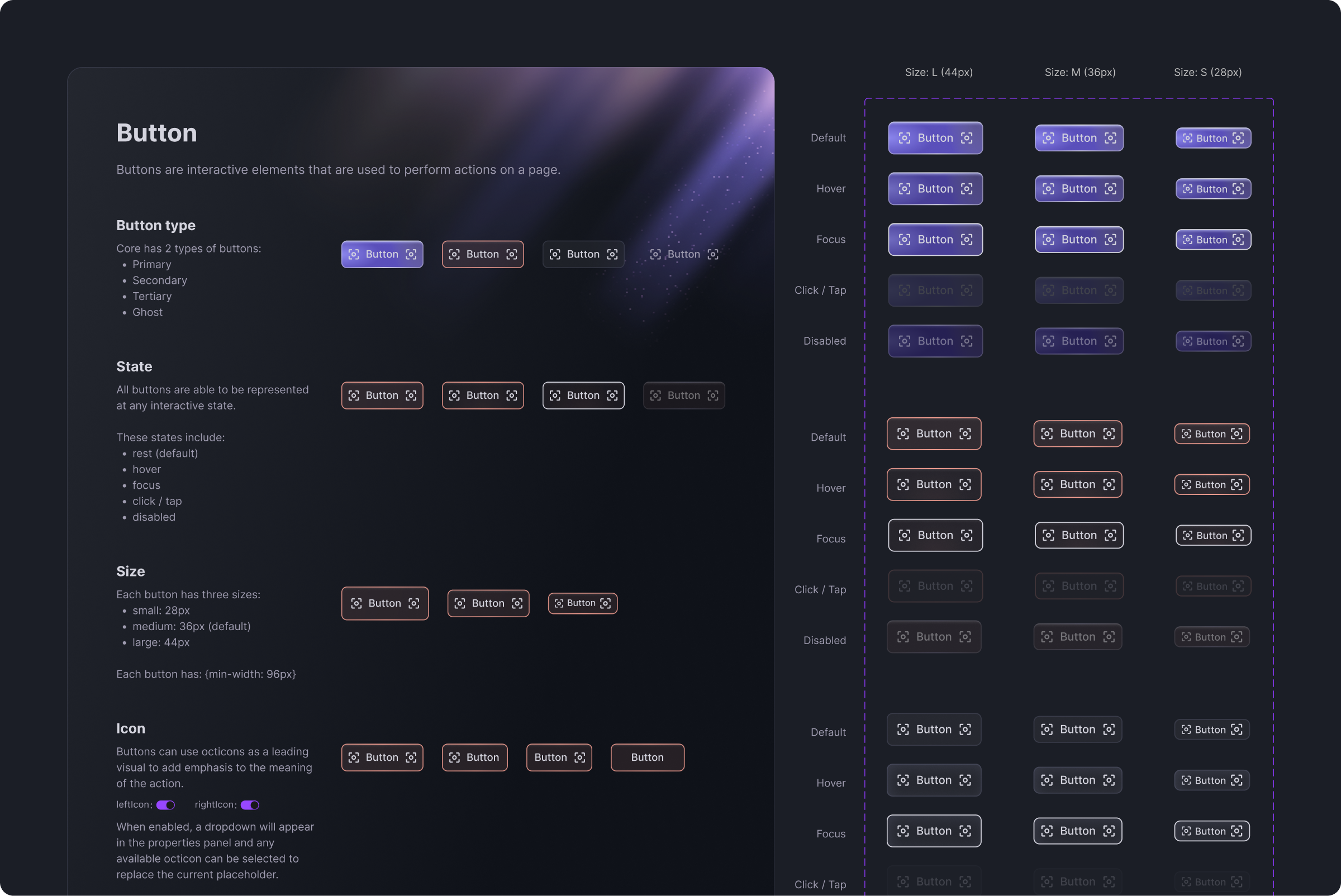
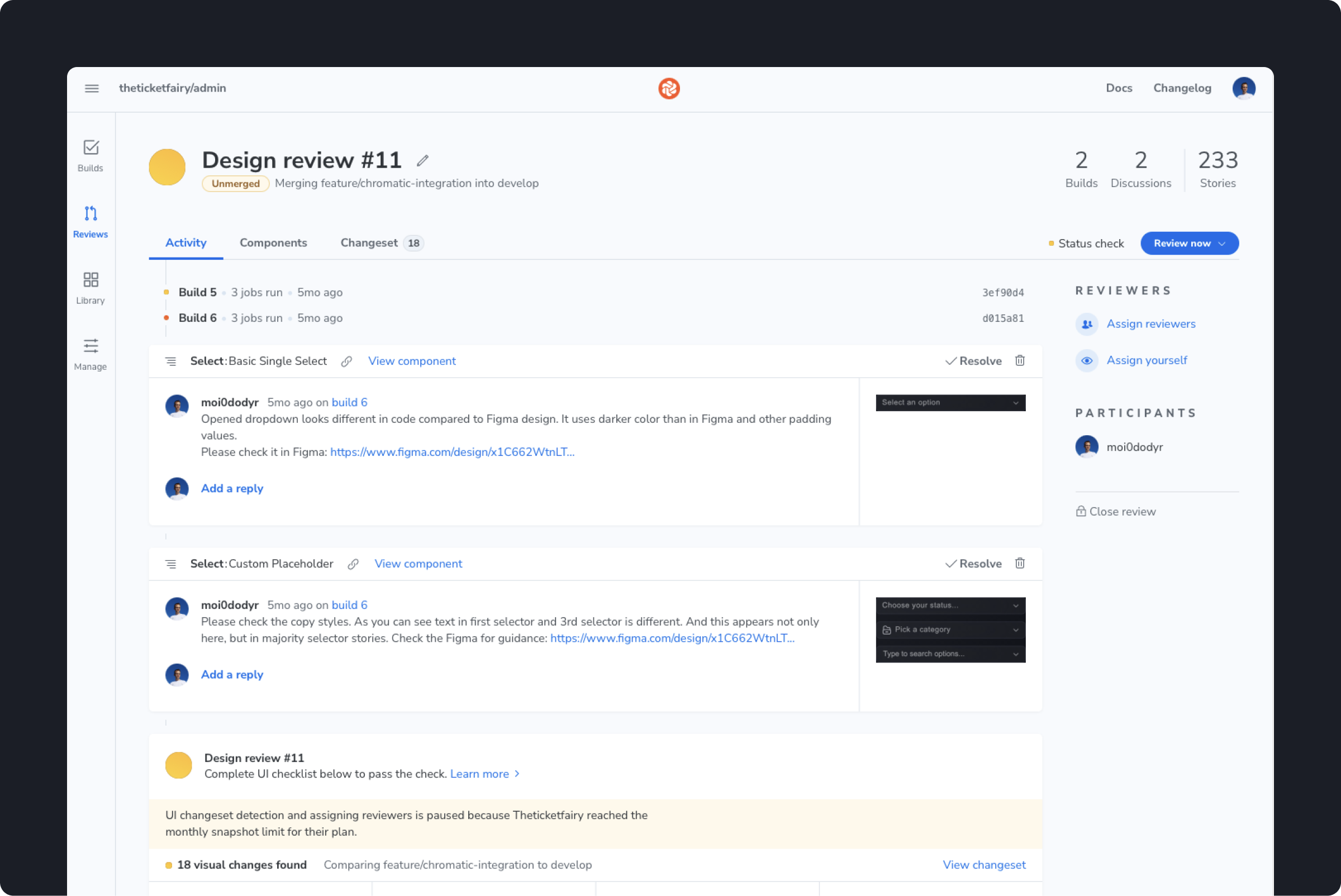
No system existed when I joined. I built one from the ground up: color, typography, and spacing tokens (semantic and primitive) and a component library that developers implemented in Storybook while I reviewed every build in Chromatic with annotated feedback, iterating until each component matched design intent.
The system spans the entire ecosystem with two design languages — information-dense, operational B2B and expressive, consumer-friendly B2C — on one shared foundation across web, iOS, and Android. Tokens were built semantic-first, so the system is theming-ready and holds WCAG-compliant contrast and target sizes — with status never carried by color alone.
Artist Management: a product inside the product
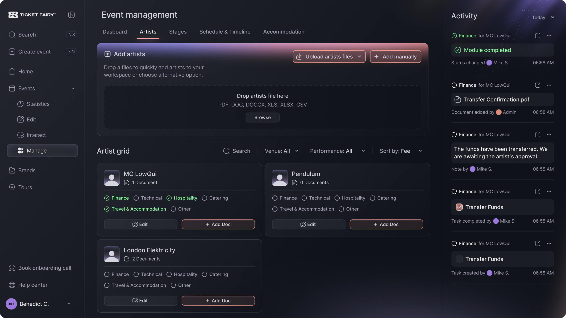
Festival organizers juggle artist contracts, riders, travel, accommodation, and equipment across dozens of emails, PDFs, and spreadsheets — with no shared visibility. I designed a centralized artist & logistics management module that, in scope and complexity, works as a standalone product embedded in the dashboard.
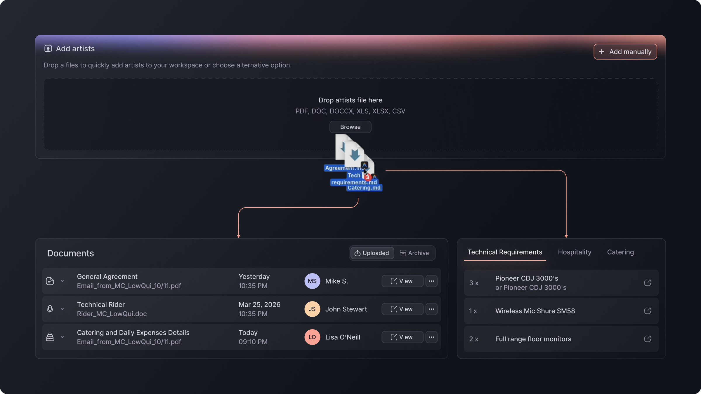
- AI-powered bulk import: organizers upload their existing documents; the system parses and routes the data into the right modules, with review/edit control and version-conflict handling (a revised contract becomes a v2, the previous version is archived).
- Role-based access for 7+ roles: each role sees only its own modules — artist fees are visible exclusively to Finance/Legal.
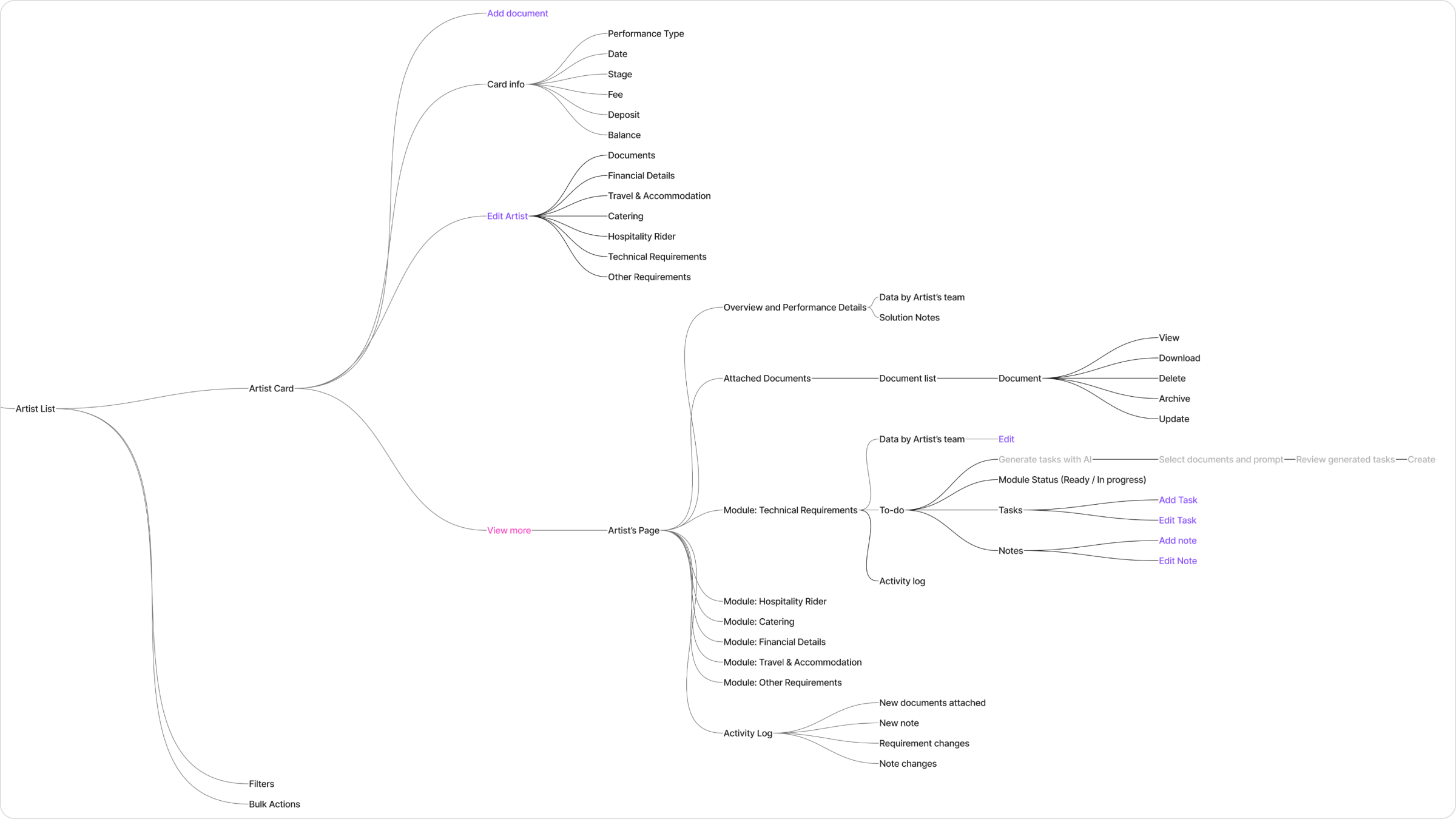
- IA before UI: I mapped a separate sitemap per role — exactly which screens and data each role can reach — before drawing a single screen.
- Real domain complexity: multi-day events, simultaneous stages, per-artist riders and logistics, hotel-room reuse across non-overlapping dates, Viberate integration for artist stats.
The work I’m proudest of isn’t a screen — it’s the role-based IA for Artist Management and the system that ties the whole platform together. That’s the part that holds up as the product scales.